How to add Tailwind CSS
About 3 min
How to add Tailwind CSS
- A web application should be responsive and attractive. We will use
Tailwind CSSas CSS framework to style our news application - The goals for this module:
- Add
Tailwind CSSto our project - Add a responsive container
- Arrange our articles in a responsive way using the CSS grid/flex
- Style our articles
- Add
Install and add Tailwind CSS
- This topics is based on the Angular.dev instructions
- To install
Tailwindyou need to execute the following command inside your project's folder:
npm install tailwindcss @tailwindcss/postcss postcss
- This command will add the following dependency in the
package.json
"@tailwindcss/postcss": "^4.1.13", // dependencies
"tailwindcss": "^4.1.13", // dependencies
"postcss": "^8.5.6", // dependencies
- Next, we have to create a
.postcssrc.jsonfile in the root of the project with the following content:
{
  "plugins": {
    "@tailwindcss/postcss": {}
  }
}
- Finally, open the
src/styles.cssfile and add the following content:
@import "tailwindcss";
- From now on we can use
Tailwind classesto style our Angular application!
Using Tailwind CSS
- Using
Tailwind CSSis nothing more than adding tailwind classes to your HTML elements - These tailwind classes are very declarative and straightforward (if you have a good knowledge of CSS 😉)
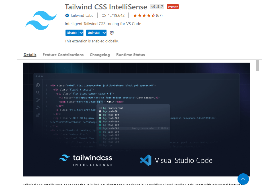
TIP: Tailwind CSS IntelliSense in VS Code
- Install the following extension to get IntelliSense for the tailwind classes
A container
- First we're going to create our basic layout
- We want our navigation menu and router-outlet below each other
- We want the router_outlet to be a container
- Change the contents of the
app.htmlwith the following code:
<div class="flex flex-col space-y-4 min-h-screen text-black bg-gray-100">
  <app-menu-component></app-menu-component>
  <main class="container mx-auto p-4 flex-1">
    <router-outlet></router-outlet>
  </main>
</div>
div:
| tailwind class | description |
|---|---|
flex | flex container: display: flex; |
flex-col | one below each other: flex-direction: column; |
space-y-4 | margin top/bottom |
min-h-screen | div's height is minimum the viewport height: min-height: 100vh; |
text-black | text color |
bg-gray-100 | background color |
main:
| tailwind class | description |
|---|---|
container | responsive container: width: 100%; |
mx-auto | center screen: margin left/right : auto; |
flex-1 | allow a flex item to grow and shrink as needed, ignoring its initial size: flex: 1 1 0% |
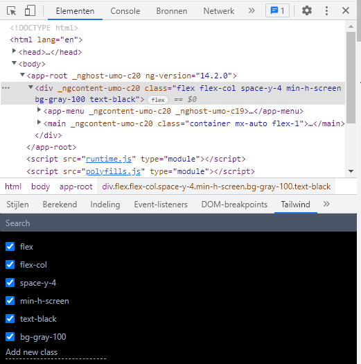
- Make sure to remove (or comment out) all the CSS from the
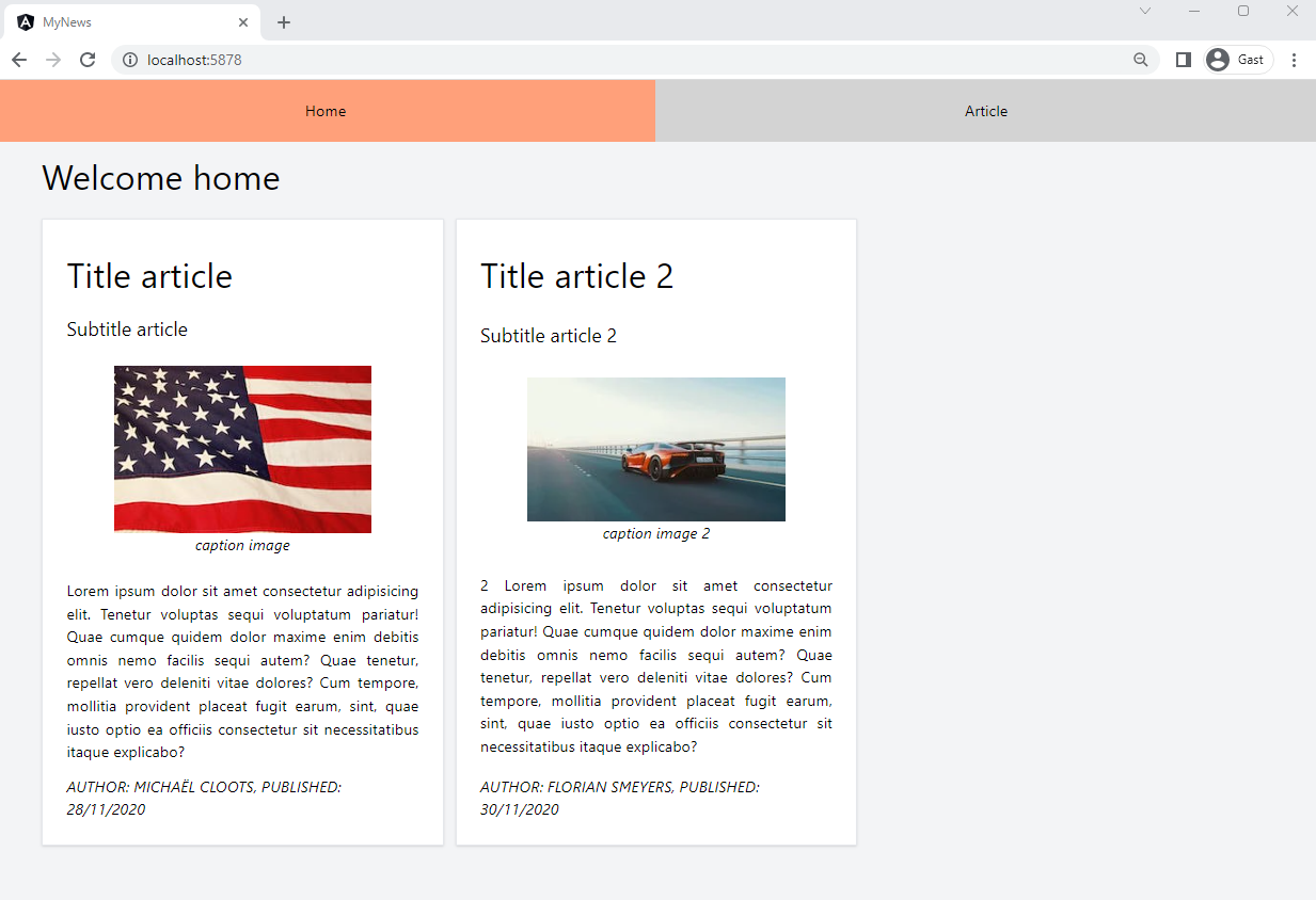
ArticleComponent(article-component.css)! - The result should look like this:
TIP: Developer Tools
- You can easily toggle Tailwind classes within the developer tools after installing the Devtools for Tailwind CSS plugin
- You can also add classes to see how the elements behave
Article grid/flex
- Our next goal is to use a grid system to position the article cards in a responsive way
- First we will add the grid system to our
home-component.htmland we add some basic styling to theapp-article-component:
<h1 class="text-4xl">Welcome home</h1>
<div
  class="grid grid-cols-1 md:grid-cols-1 lg:grid-cols-2 xl:grid-cols-3 gap-3 mx-auto py-6"
>
  @for (article of articles; track $index) {
  <app-article-component [article]="article"></app-article-component>
  }
</div>
| tailwind class | description |
|---|---|
text-4xl | font-size and line-height |
grid | creates a CSS grid: display: grid; |
grid-cols-1 | mobile-first: by default there is 1 column |
md:grid-cols-1 | medium breakpoint ( > 768px): 1 column |
lg:grid-cols-2 | large breakpoint ( > 1024px): 2 columns |
xl:grid-cols-3 | extra large breakpoint ( > 1280px): 3 columns |
gap-3 | gap/size between the columns |
py-6 | padding top/bottom |
Result so far:
Now we're going to style the article component itself:
article-component.html
@if(article) {
<article
  class="flex flex-col justify-between h-full bg-white border-gray-200 border-2 p-6 shadow"
>
  <h1 class="text-4xl my-3">{{article.title}}</h1>
  <h4 class="text-xl my-3">{{article.subtitle}}</h4>
  <figure class="self-center my-3">
    <img
      class="max-w-full h-auto"
      src="{{article.imageUrl}}"
      alt="{{article.imageCaption}}"
    />
    <figcaption class="italic text-center">{{article.imageCaption}}</figcaption>
  </figure>
  <p class="text-justify my-3">{{article.content}}</p>
  <footer class="italic uppercase">
    <p>Author: {{article.author}}, Published: {{article.publishDate}}</p>
  </footer>
</article>
}
| tailwind class | description |
|---|---|
flex | flex container: display: flex; |
flex-col | all elements within <article> below each other: flex-direction: column; |
justify-between | distribute all flex items evenly on the main axis (first item at the start, last item at the end): justify-content: space-between; |
border-gray-200 | border color |
border-2 | border width |
shadow | box shadow |
h-full | full height: height: 100%; |
self-center | item is placed around the center on the cross axis: align-self: center; |
max-w-full | responsive image: max-width: 100%; |
h-auto | responsive image: height: auto; |
italic | font-style: italic; |
text-center | text-align: center; |
text-justify | text-align: justify; |
uppercase | text-transform: uppercase; |
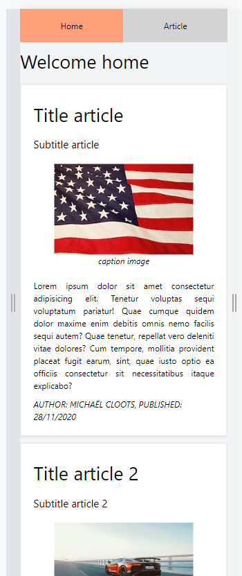
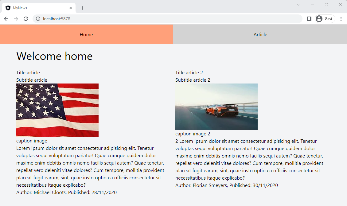
- End result: