How to create a responsive navbar
About 4 min
How to create a responsive navbar
- At the moment our navbar is not responsive
- Right now we should have enough Angular and Tailwind knowledge to make the navbar responsive
The idea
- The idea is to create a navbar that shows all the navigation links on medium screen and bigger
- On a device smaller than medium we want to show the hamburger icon instead of the links
- Clicking on the hamburger icon toggles a list of the navigation links one below each other
The process
- We'll create our responsive navbar in the
menu.component.html - First remove all the CSS in the
menu.component.css!!!
nav
- We start with the surrounding semantic
nav-tag - We're giving it a white background, a gray border and some padding
<nav class="bg-white border-gray-200 px-2 sm:px-4 py-2.5"></nav>
div container
- Inside the nav we define a
divcontainer, which is a flexbox containing- The title
- The hamburger icon (button) = hidden on medium screens and larger
- Another
divwhich contains theul, the actual list of navigation links
flex-wrap: wraps the item to a new row if there is not enough spacejustify-betweencreates an equal space between all items (main axis) = horizontallyitems-centeraligns the items along the center of the container's cross axis = vertically
<nav class="bg-white border-gray-200 px-2 sm:px-4 py-2.5">
    <div class="container flex flex-wrap justify-between items-center mx-auto">
    </div>
</nav>
Title
- The link that contains the title is also a flexbox container
- The child items are aligned along the center of the container's cross axis = vertically
- The
spanalso aligns itself along the center of the container's cross axis = vertically
<nav class="bg-white border-gray-200 px-2 sm:px-4 py-2.5">
    <div class="container flex flex-wrap justify-between items-center mx-auto">
        <a href="#" class="flex items-center">
            <span class="self-center text-xl font-semibold">My News</span>
        </a>
    </div>
</nav>
Hamburger icon (button)
- The button has several Tailwind classes
inline-flex: creates an inline flex container that flows with text- Center the span & svg (across the main axis)
focus:ring-2surrounds the element with a ring on focusrounded-lg: the button is rounded with a 'large' radiusmd-hidden: the button is hidden if medium screen or larger
- The
spanis used for the screen readers. The text is not visible but will be read by screen readers on focus =sr-only - The
svgandpathare just the three lines to create the hamburger icon
<nav class="bg-white border-gray-200 px-2 sm:px-4 py-2.5">
    <div class="container flex flex-wrap justify-between items-center mx-auto">
        <a href="#" class="flex items-center">
            <span class="self-center text-xl font-semibold">My News</span>
        </a>
      <button (click)="toggleHamburger()" data-collapse-toggle="navbar-default" type="button"
            class="inline-flex items-center p-2 ml-3 text-sm text-gray-500 rounded-lg md:hidden hover:bg-gray-100 focus:outline-none focus:ring-2 focus:ring-gray-200"
            aria-controls="navbar-default" [attr.aria-expanded]="hamburgerOpen">
            <span class="sr-only">Open main menu</span>
            <svg class="w-6 h-6" aria-hidden="true" fill="currentColor" viewBox="0 0 20 20"
                xmlns="http://www.w3.org/2000/svg">
                <path fill-rule="evenodd"
                    d="M3 5a1 1 0 011-1h12a1 1 0 110 2H4a1 1 0 01-1-1zM3 10a1 1 0 011-1h12a1 1 0 110 2H4a1 1 0 01-1-1zM3 15a1 1 0 011-1h12a1 1 0 110 2H4a1 1 0 01-1-1z"
                    clip-rule="evenodd"></path>
            </svg>
        </button>
    </div>
</nav>
Navigation links list
- Last but not least we add a
divand aulwithin this div which contains the navigation links - The
div:w-full: the div takes all the available width (100%)md-block: medium and larger screens: the div is shown and acts like a block level elementmd:w-auto: medium and larger screens: the width is automatically determined[ngClass]="hamburgerOpen ? 'block' : 'hidden'": based on if we clicked the hamburger icon yes/no the div is shown/hidden- The boolean
hamburgerOpenis set in the component class
- The boolean
- The
ul:flex flex-col: items are organised one below each other in a flex waymd:flex-row: medium and larger screens: items are organised in a row, next to each othermd:space-x-8: medium and larger screens: create some horizontal space between the items
<nav class="bg-white border-gray-200 px-2 sm:px-4 py-2.5">
  <div class="container flex flex-wrap justify-between items-center mx-auto">
    <a href="#" class="flex items-center">
      <span class="self-center text-xl font-semibold">My News</span>
    </a>
    <button (click)="toggleHamburger()" data-collapse-toggle="navbar-default" type="button"
            class="inline-flex items-center p-2 ml-3 text-sm text-gray-500 rounded-lg md:hidden hover:bg-gray-100 focus:outline-none focus:ring-2 focus:ring-gray-200"
            aria-controls="navbar-default" [attr.aria-expanded]="hamburgerOpen">
            <span class="sr-only">Open main menu</span>
            <svg class="w-6 h-6" aria-hidden="true" fill="currentColor" viewBox="0 0 20 20"
                xmlns="http://www.w3.org/2000/svg">
                <path fill-rule="evenodd"
                    d="M3 5a1 1 0 011-1h12a1 1 0 110 2H4a1 1 0 01-1-1zM3 10a1 1 0 011-1h12a1 1 0 110 2H4a1 1 0 01-1-1zM3 15a1 1 0 011-1h12a1 1 0 110 2H4a1 1 0 01-1-1z"
                    clip-rule="evenodd"></path>
            </svg>
        </button>
    <div class="w-full md:w-auto md:block" id="navbar-default" [ngClass]="hamburgerOpen ? 'block' : 'hidden'">
            <ul
                class="flex flex-col p-4 mt-4 bg-gray-50 rounded-lg border border-gray-100 md:flex-row md:space-x-8 md:mt-0 md:text-sm md:font-medium md:border-0 md:bg-white ">
                <li>
                    <a (click)="onHamburgerItemClick()" routerLink="/" routerLinkActive="active"
                        [routerLinkActiveOptions]="{ exact: true }" class="block py-2 pr-4 pl-3 rounded ">Home</a>
                </li>
                <li>
                    <a (click)="onHamburgerItemClick()" routerLink="/article" routerLinkActive="active"
                        [routerLinkActiveOptions]="{ exact: true }" class="block py-2 pr-4 pl-3 rounded">Article</a>
                </li>
            </ul>
        </div>
  </div>
</nav>
- The code of the
MenuComponentclass:
import { NgClass } from "@angular/common";
import { Component, inject } from "@angular/core";
import { Router, RouterModule } from "@angular/router";

@Component({
  selector: "app-menu-component",
  imports: [NgClass, RouterModule],
  templateUrl: "./menu-component.html",
  styleUrl: "./menu-component.css",
})
export class MenuComponent {
  private router = inject(Router);

  hamburgerOpen = false;

  toggleHamburger(): void {
    this.hamburgerOpen = !this.hamburgerOpen;
  }

  onHamburgerItemClick() {
    this.hamburgerOpen = false;
  }

  navigateTo(path: string) {
    this.hamburgerOpen = false;
    this.router.navigate([path]);
  }
}
Active item
- We need a little more css code to show which navigation link is active
- Go to
menu.component.cssand add the following lines:
nav a.active {
  background-color: lightsalmon;
  color: black;
}
Result
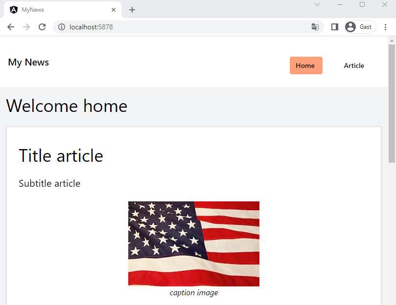
- Medium+ screen:
navbar medium
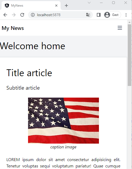
- Small screen:
navbar small 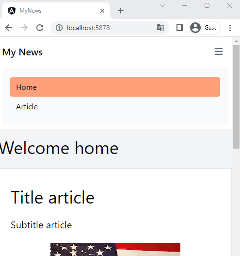
navbar small expanded