A first feature
A first feature
Navbar
Let's have a look at how the Angular apps and libs work together by adding a first feature/component to our Angular application: a navbar.
Before jumping into code, we need to make an important architectural decision: is the navbar a presentational component or a smart component?
This distinction affects where we place it inside our Nx workspace and how it interacts with the rest of the application.
Presentational vs Smart Components
In Angular and Nx architecture, we separate components into two main types:
Presentational Components
A presentational component (sometimes called a dumb or UI component) focuses purely on how things look. It's responsible for rendering inputs and emitting outputs. It doesn't know where data comes from, and it doesn't make service calls or control routing. Think of it as a reusable piece of UI that can be plugged into different contexts.
- Responsibilities: Display data via
@Input()s; emit user actions via@Output()s. - What it doesn't do: No API calls, no routing, no facades, no side effects.
- Where it lives in Nx: Typically inside a
uilibrary, such aslibs/swe-demo/uiorlibs/shared/ui. - Goal: Reusability: should work anywhere without knowing about application logic.
Smart Components
A smart component (also called a container or feature component) is in charge of how things work. It coordinates state, routing, and services. A smart component fetches data, decides what to display, and passes that data down to presentational components.
- Responsibilities: Handle routing, call services, subscribe to state, and pass data to UI components.
- What it does: Connects to the app's data layer and orchestrates behavior.
- Where it lives in Nx: Inside a
featurelibrary, such aslibs/swe-demo/feature. - Goal: Compose and coordinate other pieces, not necessarily reusable outside this app.
A quick rule of thumb
- If a component knows where data comes from, it's smart.
- If it only knows how to display it, it's presentational.
Deciding for the navbar
Now, let's apply this to our navbar. A navbar could be either smart or presentational, depending on what we expect it to do.
If the navbar's only job is to display menu links and emit events (for example, the user clicked 'Logout'), then it's presentational. It doesn't need to know about the router or authentication, those details can be handled by a parent feature.
However, if the navbar needs to decide which route is active, fetch user info, or perform a logout, then it becomes smart. It interacts with services or facades and coordinates the view.
In most real-world Nx projects, we split these roles:
- A presentational navbar in
libs/swe-demo/ui(just shows the UI and emits events). - A smart wrapper in
libs/swe-demo/feature(handles routing/authentication and provides inputs to the UI navbar).
This keeps our UI reusable while keeping logic testable and isolated.
The presentational navbar
First create the presentational component in the swe-demo/ui library using the following command:
nx g @nx/angular:component libs/swe-demo/ui/src/lib/navbar/navbar --selector lib-swe-demo-ui-navbar
Notice how our new navbar component is created in libs/swe-demo/ui/src/lib/navbar. You also see there is a swe-demo-ui component. This component is automaticcaly generated when creating the library. You can safely remove this component!
Add the following code for the component class, template and css:
//navbar.ts
import { Component, EventEmitter, Input, Output } from "@angular/core";
import { RouterModule } from "@angular/router";

export interface NavItem {
  label: string;
  path: string;
  icon?: string; // optional material icon name
}

@Component({
  selector: "lib-navbar",
  imports: [RouterModule],
  templateUrl: "./navbar.html",
  styleUrl: "./navbar.css",
})
export class Navbar {
  @Input() items: NavItem[] = [];
  @Input() showUser = false;
  @Output() navigate = new EventEmitter<string>();
  @Output() logout = new EventEmitter<void>();
}
<!-- navbar.html -->
<nav class="nav">
  @for (item of items; track $index) {
  <a
    [routerLink]="item.path"
    routerLinkActive="active"
    (click)="navigate.emit(item.path)"
  >
    @if (item.icon) {
    <i class="material-icons">{{ item.icon }}</i>
    }
    <span>{{ item.label }}</span>
  </a>
  }

  <div class="spacer"></div>
  @if (showUser) {
  <button type="button" (click)="logout.emit()">Logout</button>
  }
</nav>
/* navbar.css */
.nav {
  display: flex;
  gap: 0.75rem;
  align-items: center;
  padding: 0.5rem 1rem;
  border-bottom: 1px solid var(--border, #e5e7eb);
}
.spacer {
  flex: 1;
}
a {
  text-decoration: none;
  opacity: 0.85;
}
a.active {
  opacity: 1;
  font-weight: 600;
}
Make the component reusable by exporting it through the library's index.ts barrel, which serves as a single entry point for consumers.
//libs/swe-demo/ui/src/index.ts
export * from "./lib/navbar/navbar";
A smart wrapper for the navbar
Now create the smart component in the swe-demo/feature library using the following command:
nx g @nx/angular:component libs/swe-demo/feature/src/lib/navbar-container/navbar-container --selector lib-swe-demo-feature-navbar-container
This smart component will use the presentational component we created in the previous step so we can add authentication and routing logic later on.
Add the following code for the component class and template:
//navbar-container.ts
import { Component, computed, inject } from "@angular/core";
import { Router, RouterModule } from "@angular/router";
import { Navbar } from "@swe-monorepo/swe-demo-ui";

@Component({
  selector: "lib-swe-demo-feature-navbar-container",
  imports: [Navbar, RouterModule],
  templateUrl: "./navbar-container.html",
  styleUrl: "./navbar-container.css",
})
export class NavbarContainer {
  private router = inject(Router);

  readonly items = computed(() => [
    { label: "Home", path: "/" },
    { label: "Products", path: "/products" },
    { label: "Account", path: "/account" },
  ]);

  onLogout() {
    console.log("TODO: logging out logic");
  }

  onNavigate(path: string) {
    this.router.navigate([path]);
  }
}
<!-- navbar-container.html -->
<lib-swe-demo-ui-navbar
  [items]="items()"
  [showUser]="true"
  (navigate)="onNavigate($event)"
  (logout)="onLogout()"
></lib-swe-demo-ui-navbar>
Make the component reusable by exporting it through the library's index.ts barrel, which serves as a single entry point for consumers.
//libs/swe-demo/feature/src/index.ts
export * from "./lib/navbar-container/navbar-container";
Using the navbar-container component in our application
//apps/swe-demo/src/app/app.ts
import { Component } from "@angular/core";
import { RouterModule } from "@angular/router";
import { NavbarContainer } from "@swe-monorepo/swe-demo-feature";

@Component({
  imports: [RouterModule, NavbarContainer],
  selector: "app-root",
  templateUrl: "./app.html",
  styleUrl: "./app.css",
})
export class App {
  protected title = "swe-demo";
}
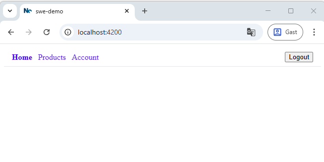
<!-- apps/swe-demo/src/app/app.html -->
<lib-swe-demo-feature-navbar-container></lib-swe-demo-feature-navbar-container>
<router-outlet></router-outlet>
Result:
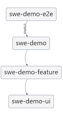
Checking the dependencies
Run nx graph again to see which dependencies we created!
Summary: Our Navbar Architecture
We implemented a modular and reusable navbar using Angular's smart/presentational component pattern. This approach allowed us to separate UI rendering from application logic, improving testability, scalability, and maintainability.
Presentational Navbar (UI Layer)
- We first created a pure UI component in the
swe-demo/uilibrary. - This component is stateless — it simply receives inputs (
items,showUser) and emits outputs (navigate,logout) when the user interacts with it. - It uses Angular's
@forand@iftemplate syntax for clean iteration and conditional rendering. - The component was exported through the
index.tsfile so other libraries or applications can import and use it.
Smart Navbar Container (Feature Layer)
- Next, we created a smart wrapper component in the
swe-demo/featurelibrary. - This component is stateful — it defines navigation items, handles user actions (like
logout), and uses Angular'sRouterfor navigation. - It composes the presentational navbar, binding data and event handlers.
- Like the UI component, it is exported via the library's barrel file for easy reuse.
Integration in the Application
- Finally, we integrated the smart
navbar-containercomponent into the rootAppcomponent of our application. - This ensures the navbar is displayed across all routes, with the
RouterOutletrendering page-specific content below it.
By structuring our navbar this way, we followed a clear separation of concerns:
- The UI library focuses purely on layout and design.
- The Feature library handles business and navigation logic.
- The App composes these parts together.
This pattern makes it easy to extend or reuse components — for example, adding authentication, user info, or feature toggles — without breaking the visual layout.